When developing a website, there is a LOT to think about, much more than you'd expect. Little things such as slightly inconsistent margins or font-sizes might not seem important, but all of these little things add up and influence the user's overall impression of the site, and your brand.
Here I will describe some of the main factors that decide whether a website is perceived as "good" or "bad".
Colours
The colours on a website are one of the first things a user notices. Sometimes the flaws are glaringly obvious, and other times they are more subtle, and may be only noticed subconsciously. Let's look at some examples.
colour is probably the most important element in web design...
colour is probably the most important element in web design...
colour is probably the most important element in web design...
As we can see, colour has a massive influence on readability. Now let's do the same test on a dark background...
colour is probably the most important element in web design...
colour is probably the most important element in web design...
colour is probably the most important element in web design...
So, clearly, the least legible colour on a white background is the most legible on a dark background, and vice versa. While this may seem obvious, it's only the tip of the iceberg when it comes to colours and their effects on user experience.
Notice how it's preferable to use a very dark grey for text rather than pure black—as pure black text on a white background actually causes eye strain. In addition, Google can detect improperly contrasting colours on a site, and this affects the site's SEO rankings.
Colours can also evoke certain thoughts and emotions from users. For instance, the colour blue is seen as trustworthy, safe and professional. Hence, lots of large corporations, like Facebook, LinkedIn, Twitter and Skype tend to use primarily blue themes. (Blue is also Dublin's colour, so choosing it for this site was a no brainer!)
Different colour combinations can make or break a site's visual appeal. Great combinations can be found on sites like Gradient Hunt or Web Gradients, while some awful ones can be found here.
Typography
Different types of font can have a huge influence on the way text is perceived. To illustrate this, let's compare the same words written in two different fonts. We'll imagine that this is an advert for a luxury brand, like Rolex.

Quite obviously, the first font style fits in much better with the brand's image. There are thousands of different fonts available online and it's important to choose one that conveys the right message.
Other issues we see quite often with typography are sizing and spacing. Having text or content that spills out of its container makes a website look very cheap and unprofessional. Insufficient line-height makes lines very close together, and gives text a squished look. Lines that are longer than 50–60 characters are also very frustrating to read as they go beyond our eyes' field of vision.
While many of us will be able to read the above sentence if we look closely, there are many elderly or visually impaired people in the world who couldn't. As a general rule, font-size should always be at least 16px. A poorly developed site will often have accessibility issues like these, and so disadvantaged people will be unable to use it properly. Dominos was recently successfully sued by a blind man who was unable to order from their site, despite using a screen-reader to help him.
Going forward, Google rankings will place heavy emphasis on accessibility, and it takes a skilled developer to make sure a site is up to scratch in this regard.
As we scroll down a website, our eyes and brains expect consistency in terms of layout and spacing. A poor developer will just wing it and have a guess at what margins and padding to use, and this often turns out badly. Insufficient white space between text, images and sections also gives a site a very cluttered feel.
Speed
I could list a whole lot of other factors, but I will conclude with website speed. Back in 2006, Amazon presented a study that showed each extra millisecond cost them 1% revenue annually. That's well over a billion dollars, each year. As technology advances, our attention spans are waning. Thus, it's becoming more and more important to have fast loading times on websites.
The most obvious solutions to improving website speed are;
- Optimising images
- Using the right technology for the job
- Coding the site correctly
The easiest one to fix is optimising or compressing images. Take a look at the two images of the Rolex above. There's not much visible difference, right? Well, in fact, the first one's file size is 2.3MB, and the second one is only 28kb, nearly 100 times smaller than the un-optimised version. Serving massive uncompressed images, especially to people on mobile phones with slow internet—can easily add seconds to loading time. It is much better to run all images through an optimiser, like ImageOptim, and then create cropped versions for phone screens.
Regarding using the right technology for building a site, it takes some knowledge and experience to choose the best option. For simple, static, brochure sites it is easiest and best for performance to just use HTML, CSS and, if necessary, some Javascript. These type of sites are basically just to show people what your business is about. They usually consist of a handful of pages (Home, About, Services, Gallery, Contact), and don't require any logins, databases, e-commerce, or complex functionality.
A skilled developer will be able to quickly build a site that is fast, performant, SEO-friendly, and super cheap to host on something like Netlify. Lots of small businesses such as barbers, flower shops, or bakeries should have sites like this. Using WordPress or React for sites like this is unnecessary and will affect loading times. Oftentimes people that don't know how to code will rely on things like Wix, SquareSpace or WordPress for these sites, but these will never be as fast as a well-coded, purpose-built site produced by a developer, and are often more expensive too.
If a site needs a lot of user interaction (likes, comments, posts, refreshing news feed, etc), then something like React.js will be ideal for the job. React allows certain areas of the page to be updated without reloading the whole page. So, sites like Facebook, Instagram and Reddit are built on React.
If a business wants a website and their main focus is a blog, with maybe a small amount of e-commerce and they also want the option to edit their content regularly, then WordPress is a good option. Just be aware that WordPress often relies on numerous plugins to add functionality, and these can cause the site to become slow, and they also need to be regularly updated to keep the site running smoothly. If the main focus is on e-commerce, then something like a Shopify site will probably be ideal.
All of the above options come with their pros and cons, and it takes a skilled and knowledgeable developer to make an informed choice about which tool to use for the job.
Finally, there are many techniques a good developer will use to ensure optimal site speed. These include "lazy-loading" images (so that they don't load until a user scrolls near them), minifying CSS/JS bundles, caching (so that return visitors don't have to load everything again), using Content Delivery Networks (delivering your content from a nearby data center), and organising the order of the HTML, CSS and JS code so that certain things get loaded before others.
Conclusion
I could go on and on forever about all the components of web development, but for the sake of brevity I will wrap it up here.
Besides just using our eyes to decide if a website looks good or bad, there are tools that will rank a website for its speed, accessibility, SEO, best practices and more. Below is a comparison of one of my client website results, before and after I worked on their site.
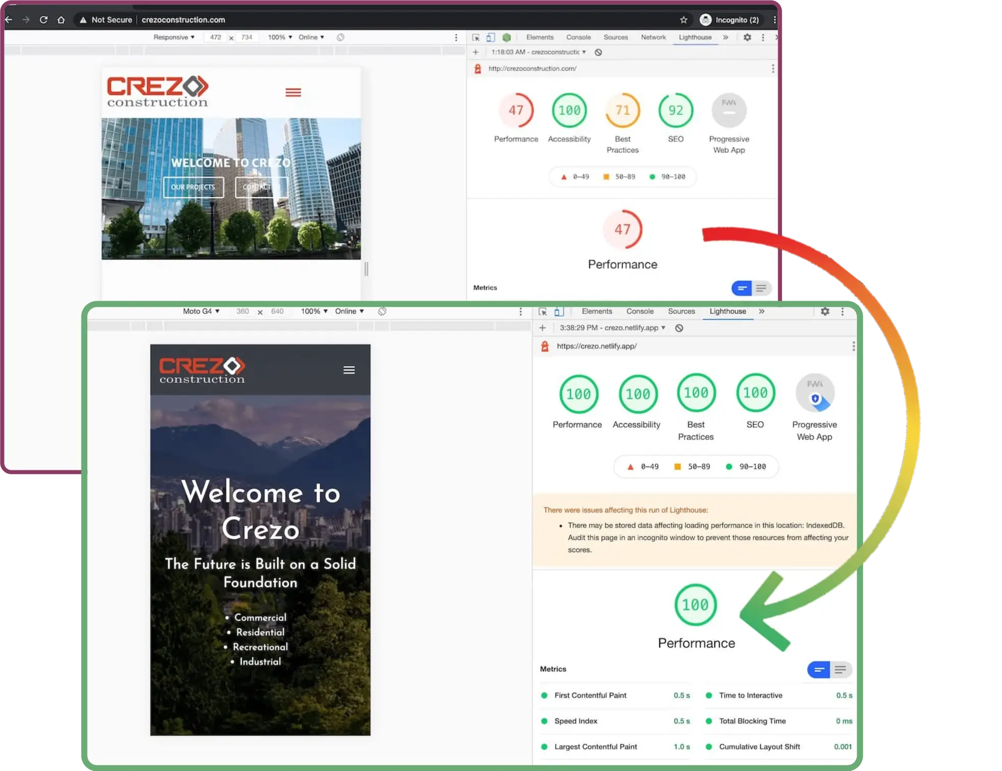
A good website should be getting at least 85 on all of these performance markers. Scores below this will mean your page gets moved down in search engine rankings, and could be costing you customers, credibility and lots of money!
I hope this article has given you some enlightenment on what makes a website good or bad. If you have any questions or would like more info, give us a call or an email and we'd be delighted to chat!